GenerateBlocks Pro 2.3 introduced a game-changing duo: Overlay Panels and Display Conditions. Whether you’re building popups, flyout menus, or personalizing content for specific visitors, this release opens up powerful new possibilities — all with the tools you’re already used to.
In this tutorial, I’ll walk you through how these new features work, step by step:
- How to build and configure popups
- How to create anchored panels (great for flyouts and tooltips)
- How to use the new conditions engine to control when/where panels appear
Let’s dive in.
Overlay Panels Overview
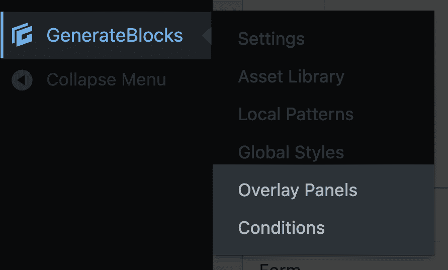
Once you’ve installed GenerateBlocks Pro 2.3, you’ll notice two new menu items under GenerateBlocks in the admin dashboard:
- Overlay Panels
- Conditions
Overlay Panels allow you to create:
- Standard popups
- Anchored panels
- Mega menus (covered in this separate tutorial)
Each panel type has its own use cases and behavior — but they all share a consistent interface and design workflow.
Building a Standard Popup
Let’s start by creating a simple popup.
- Navigate to Overlay Panels → Add New
- Choose Standard as the panel type
- Give your panel a name (e.g.
Timed Offer Popup)

Key Settings:
- Trigger Type:
- Standard panels support several trigger types:
- Click
- Hover
- Click & Hover
- Exit Intent
- Percentage Scrolled
- Time Delay
- Custom Event
- For testing, choose Time Delay, and set it to
500(0.5 seconds)
- Standard panels support several trigger types:
- Close Behavior:
- Choose how long before the popup can reappear after being dismissed
- Backdrop Options:
- Enable backdrop overlay (recommended)
- Add blur (e.g.
5px) to soften the background behind the popup
- Popup Position:
- Set to Center for a typical modal
- Interaction Settings:
- Enable Close on Escape and Close on Click Outside
- Width Mode:
- Choose between Fit Content or Full Width
- Animations:
- Choose entrance and exit animations (e.g.
Fade In / Fade Out)
- Choose entrance and exit animations (e.g.

Designing the Popup Content
Inside the panel editor, you can use any block you like — containers, text, images, buttons, even forms. There’s nothing new to learn, and you retain full control over layout and styling.
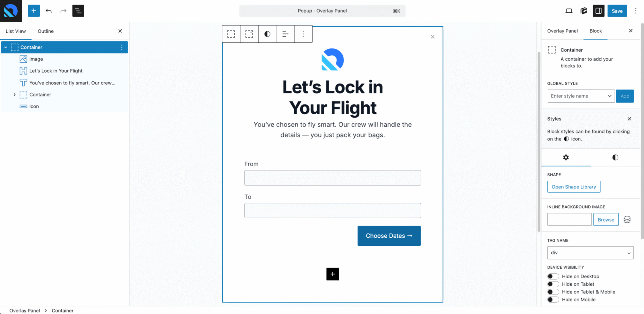
In this example, I pasted in a saved layout featuring:
- A white background container
- A product image
- Promotional text
- A simple form
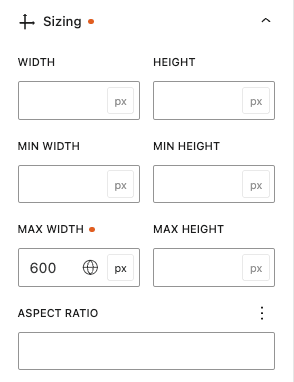
The outer container has a max-width of 600px to prevent the popup from stretching too wide.
Once your content is in place, save the panel.
Adding Close Functionality
Popups don’t automatically come with a close button — you’ll need to configure one.
To add a close button:
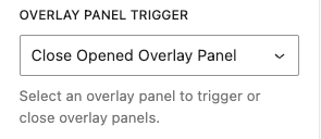
- Insert a Button block inside your panel
- Select the button, go to Advanced Settings
- Under Overlay Panel Trigger, choose Close Opened Overlay Panel
Triggering the Popup by Click
Want your popup to appear when a button is clicked instead?
- Go back to your panel settings
- Change the Trigger Type to Click
- Save the panel
Now let’s hook it to a button on your site.
Example: Linking a “Book Now” button in your header.
- Edit your Header Element
- Select the button
- Change the HTML tag to
<button> - Remove the old link
- Under Advanced Settings, select your popup from the Overlay Panel Trigger dropdown
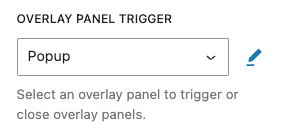
Save your changes, reload the front end, and click your button — the modal should appear as expected.
Building Anchored Panels
Anchored panels are similar to popups, but they’re tied to a specific element on the page. Think flyout menus, tooltips, or dropdown panels.
Let’s create one.
- Add a new Overlay Panel → Select Anchored
- Name it something like
Account Flyout Menu - Set the Trigger Type to Click or Hover
- Set the Position to Bottom Right
- In the Anchor Selector, enter a unique class (e.g.
.header-profile-img)

Then:
- Save the panel
- Edit the block (e.g. an image) that should trigger the flyout
- Assign the matching class to it (e.g.
.header-profile-img)

Now, when you hover or click that image, your flyout panel will appear — perfectly anchored.
Using Display Conditions
Now for the real magic: Display Conditions.
These let you control when and where your panels appear based on logic like:
- Logged-in status
- Query parameters
- User roles
- Page/post type
- Referrer or device type
To set a condition:
- In your panel settings, next to Display Condition, click the ➕ icon
- Create a new condition group
- Example: Show only if the URL contains
?popup=true
Steps:
- Name:
Popup=True - Condition:
Query Parameter - Logic:
popup equals true
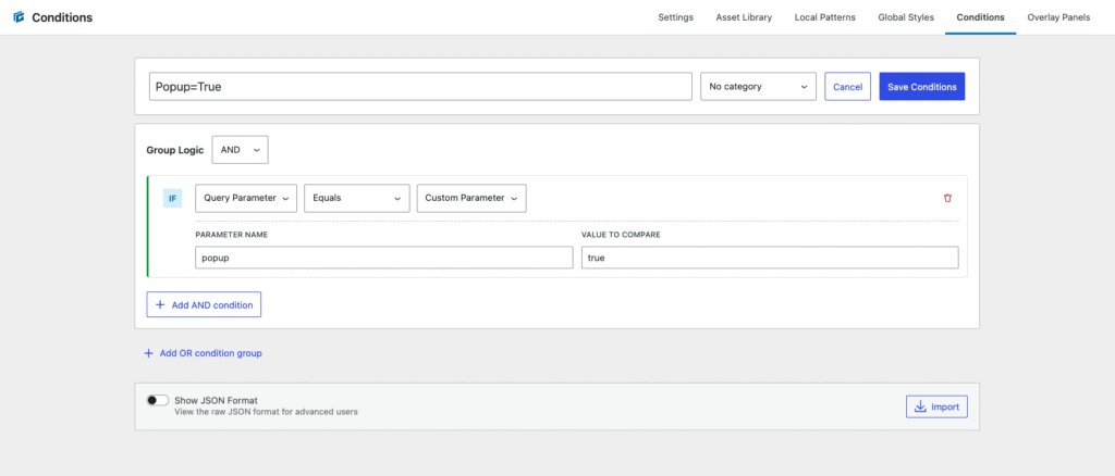
Save and apply the condition to your panel.
Now, the panel will only appear when the query parameter is present in the URL — perfect for personalized offers or limited campaigns.
Example Use Case: Social-Only Offers
Let’s say you want to display a special offer to visitors coming from Instagram or LinkedIn.
You could:
- Set the panel to trigger with a query string like
?campaign=linkedin - Add a condition to only show when that parameter exists
- Link to your site from social posts with the full URL
This ensures the offer is only shown to the intended audience, and not every visitor to your site.
Final Thoughts (and What’s Next)
The new Overlay Panels and Conditions systems in GenerateBlocks Pro 2.3 are incredibly powerful — and this post only scratches the surface.
With full layout control, flexible triggers, and advanced conditions, you can build:
- Promotional popups
- Context-aware callouts
- Flyout menus and user panels
- Personalized user journeys
And, if you prefer watching instead of reading, this entire tutorial is available in video form:
Need Help Building It?
If you’re excited about what these new features can do but don’t have the time (or patience) to set it all up — I’d love to help.
At OGAL Web Design, I specialize in custom WordPress builds using GeneratePress and GenerateBlocks — and these new Overlay Panels are already part of my workflow.
If you want popups, flyouts, or personalized layouts built the right way, don’t hesitate to say hi 👋


