
“Kyle set a new standard for what I expect out of a web designer with this experience: great communication, expert professionalism, and a kick-ass beautiful website as the final result.”

Vice-president, Termageddon
Termageddon is the most comprehensive website policies generator on the market. They provide website policies that automatically update as the laws change, and their business has absolutely exploded.
Used by digital agencies, website designers, law firms, and pretty much anyone who owns a website, Termageddon’s software helps you stay compliant with consumer protection laws, provide the necessary online legal disclosures, and limit your liability.
Their offering is absolutely amazing – but unfortunately their old website wasn’t.
With the largest segment of their customer base being website designers and developers, their site needed to impress – and follow speed and accessibility best practices too.
So, in June of 2022, we created a completely new design with a modern UI that would appeal to their target demographic – and improve their performance, accessibility, and SEO at the same time.
Let’s take a look at Termageddon’s website overhaul in more detail.
The Problems
Termageddon was founded by a licensed attorney focused on privacy and international contracts law and an ex-digital agency owner. As a result, they knew exactly what good website design is – they just didn’t have time to do it themselves.
The outdated website had served them well and helped the company grow from its inception to one of the most popular policy generator options on the market – but it no longer reflected the level of professionalism the now-established company and product delivered.
They already had some great content on the website, but the design itself wasn’t user friendly (or Google friendly).
See what Termageddon co-founder, Hans Skillrud, had to say about the problems they were facing with the website:
Owners Hans and Donata were also concerned about the website’s level of accessibility, as well as its poor page loading speed.

As you can see by the initial tests run, the website’s performance was a major concern.
Over the course of the 8-week project we achieved some serious improvements:

In this case study we’re going to take a look into what went into the website redesign and rebuild for Termageddon, as well as both the immediate and long-term results that they experienced.
Let’s dive in!
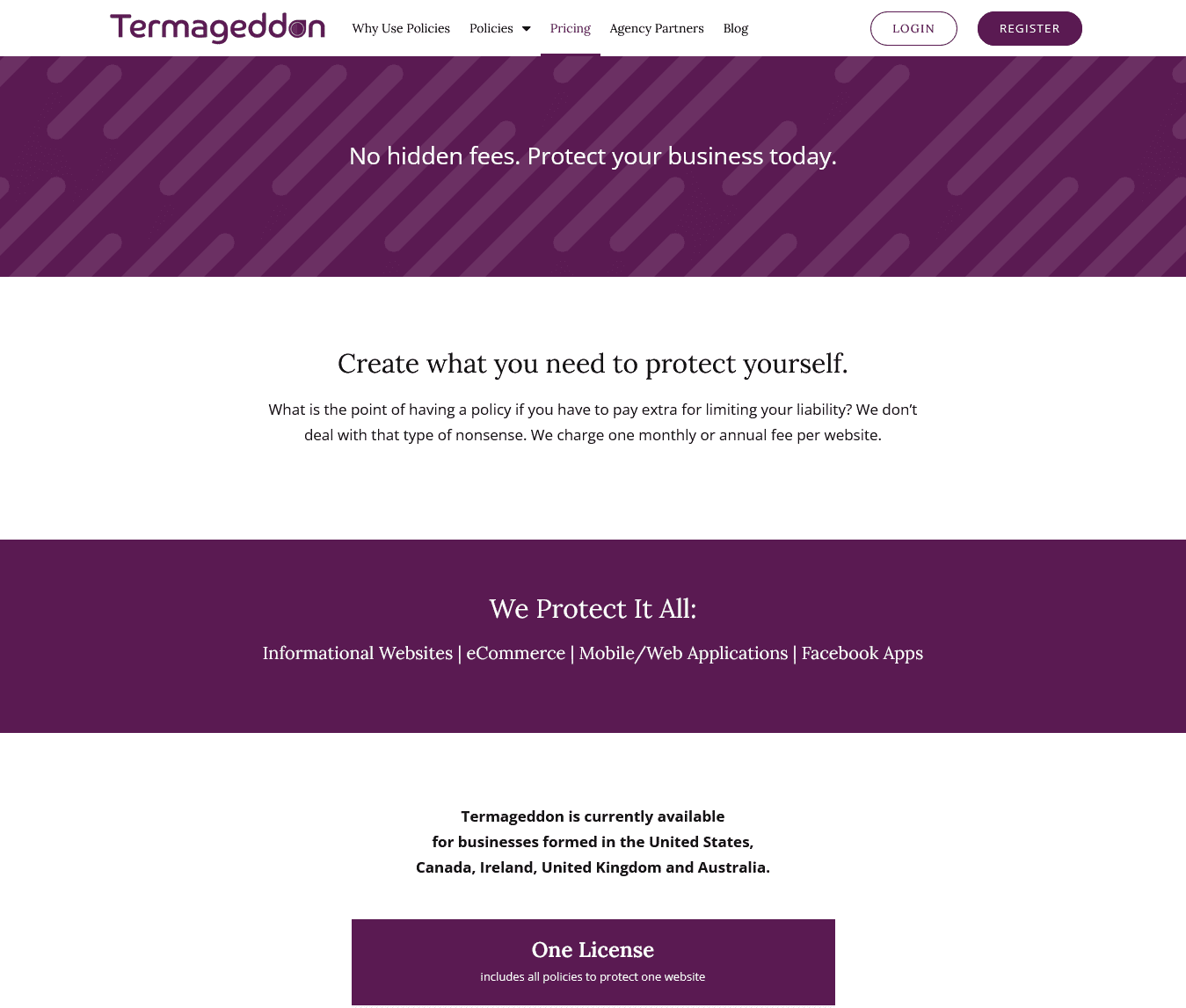
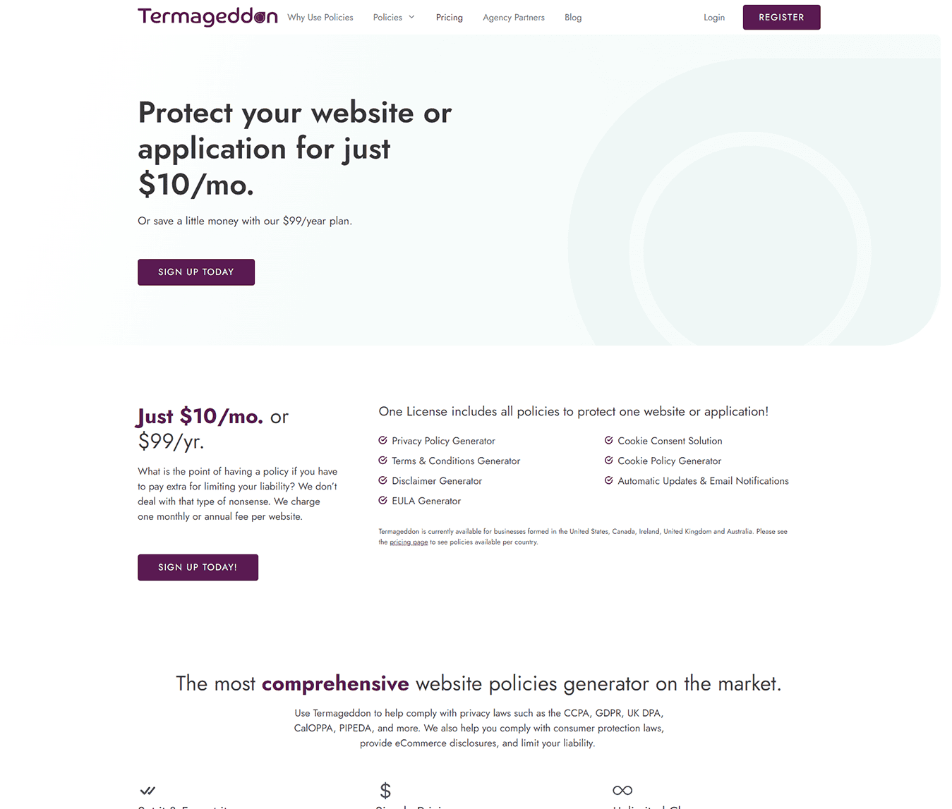
A Brand-New Design from Top to Bottom
“Kyle made a mock-up of our homepage, and it really struck a chord with us. We fell in love with our new, refreshed look immediately.”
To begin the process of creating a hard-working website that would do this great company justice, I started with a new look.
The new website’s design is sleek and minimalistic – in stark contrast to the old one. Though thier main brand color (a striking purple) is great and helps set them apart, it was overdone in the old site making it nearly impossible for anything to stand out.
One of the first major changes was introducing a soft, complementary green color to help the purple be more effective in standing out for calls to action.
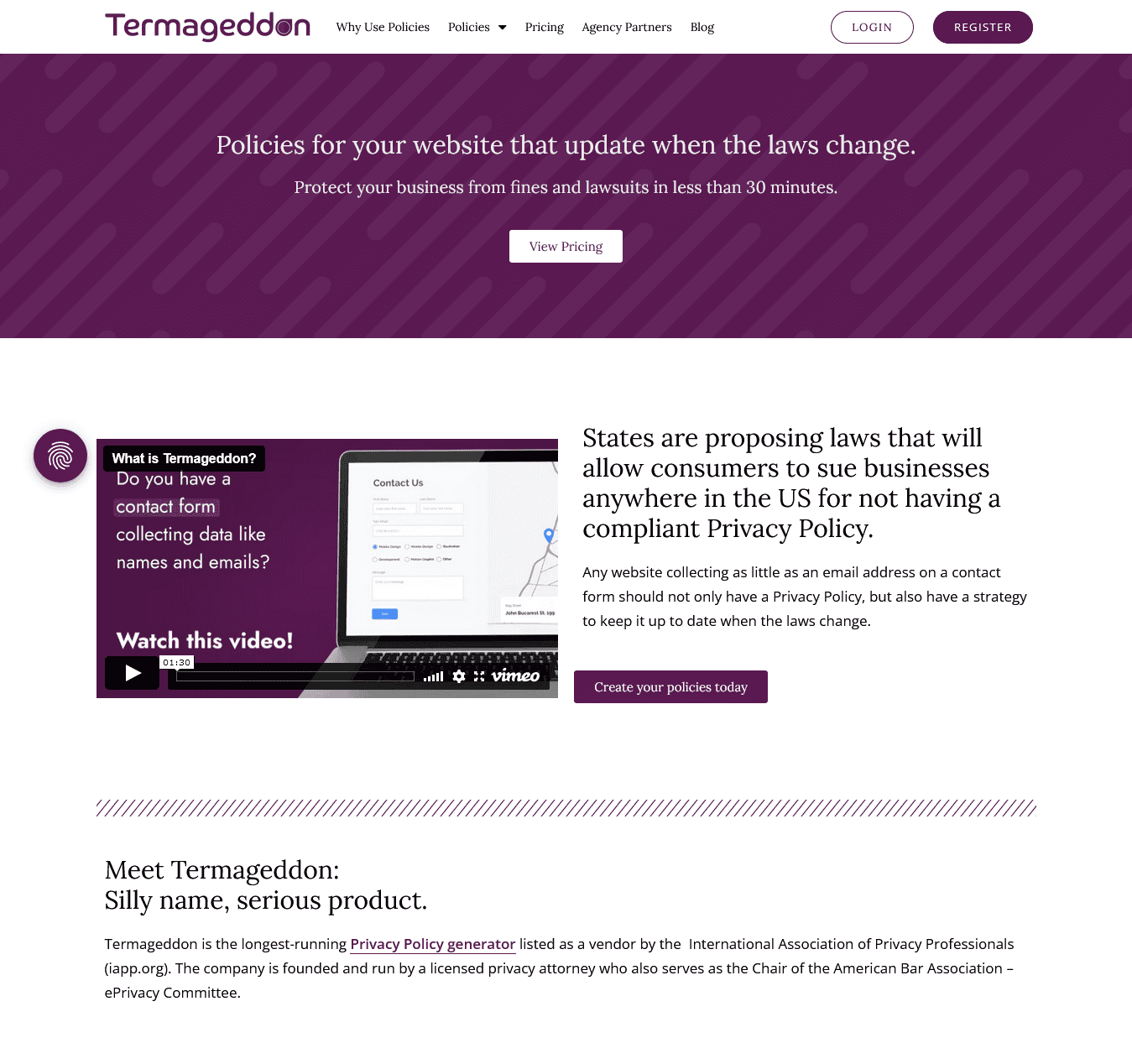
I completely restructured the layout of the home page to highlight the most important benefits of choosing Termageddon over any other options.
To improve each page’s user-friendliness, I:
- Created easy-to-understand icons
- Chose an easy-to-read font
- Kept the use of Termaggedon’s purple to a minimum on the page for maximum effect
- Used photos of real customers to give the reader a human connection
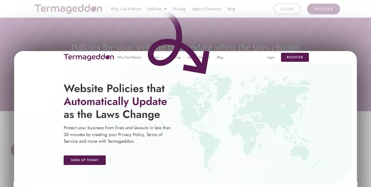
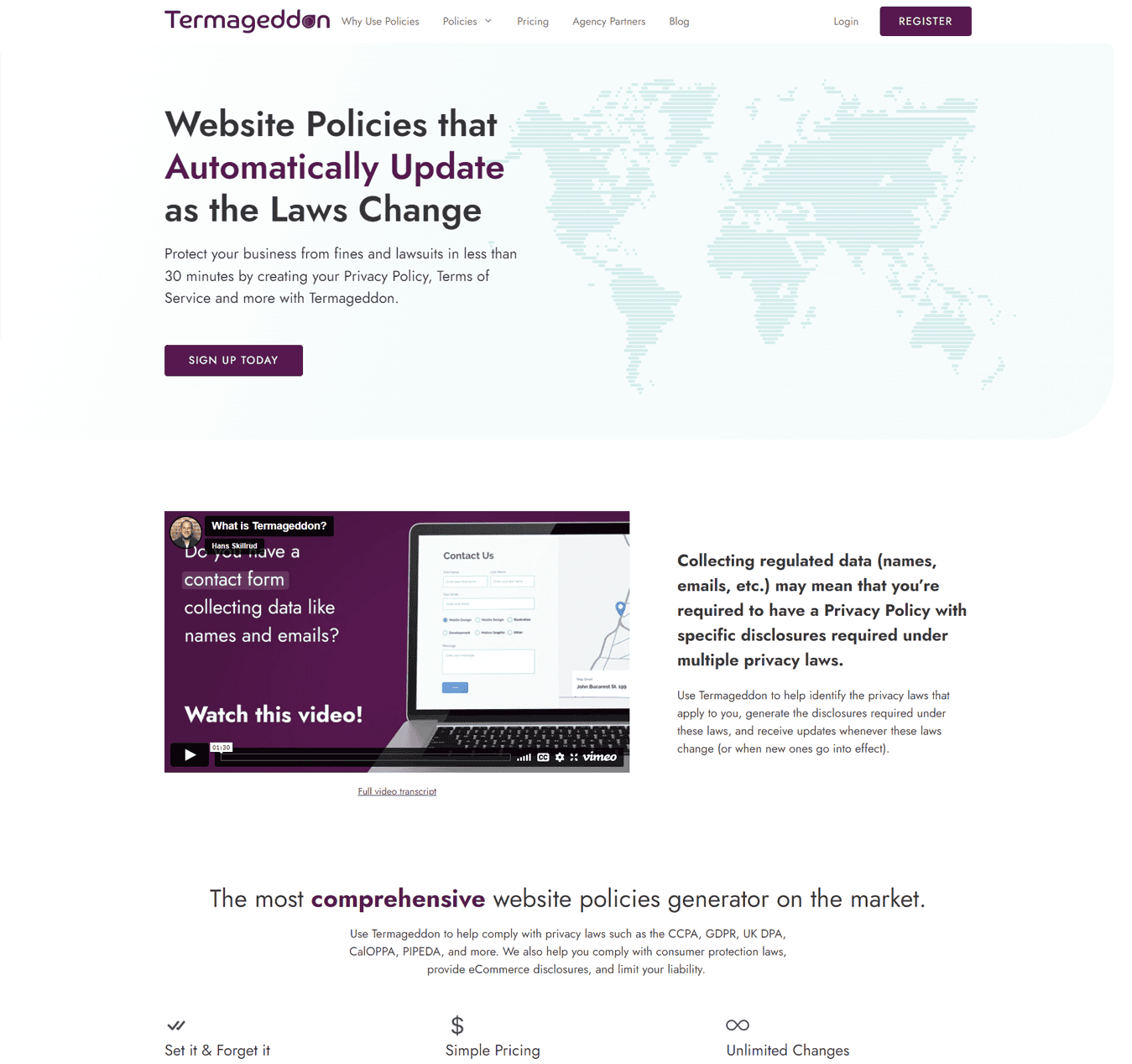
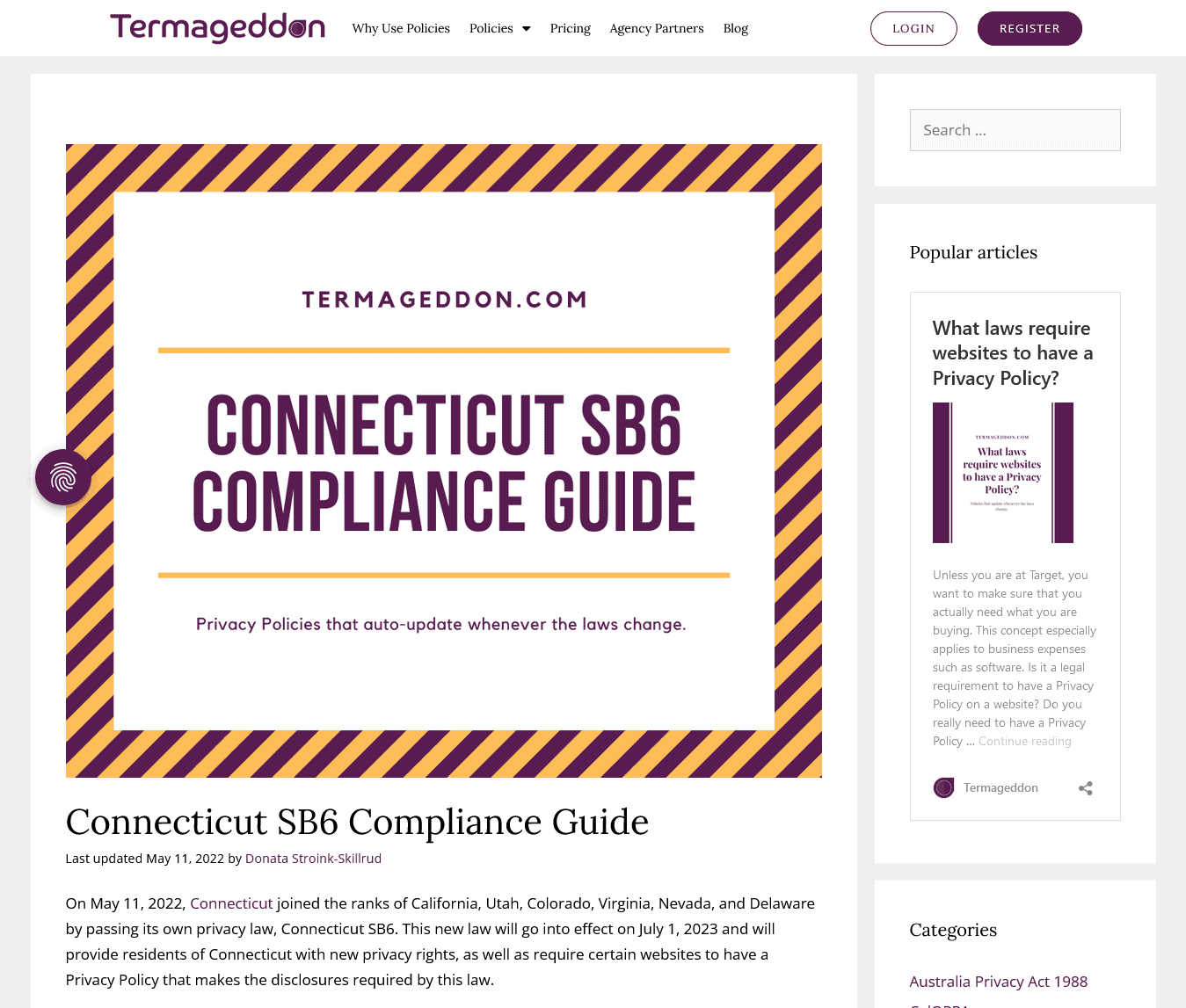
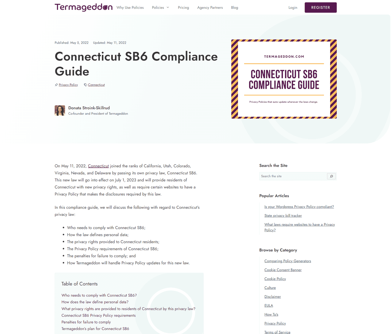
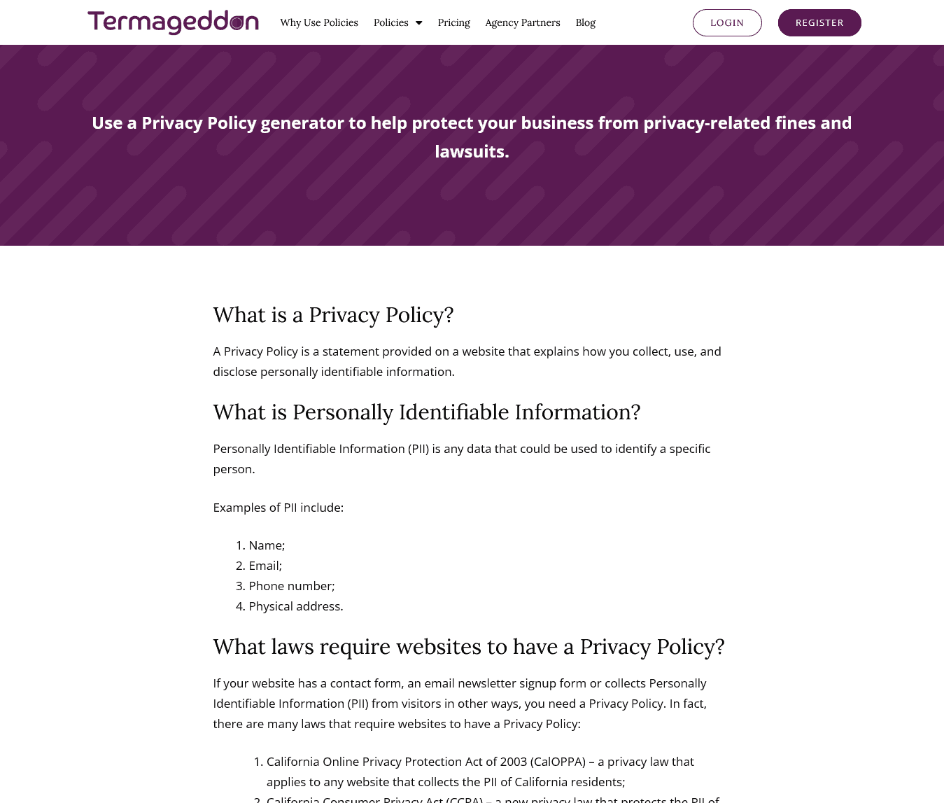
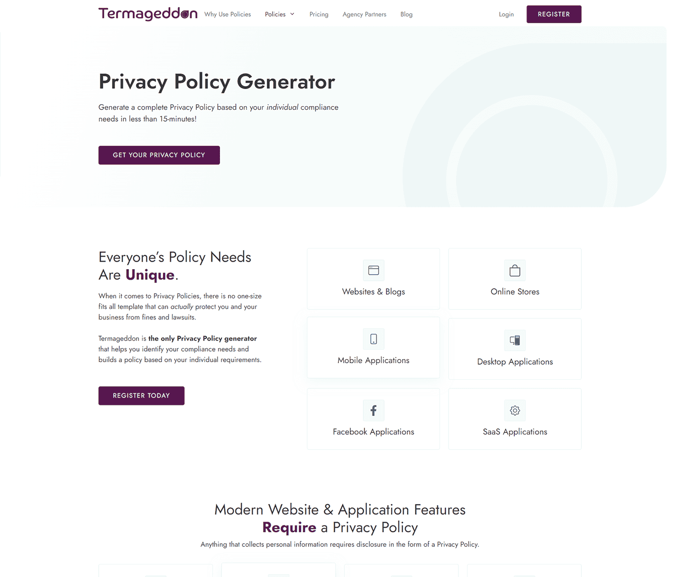
Here are a few more before & after shots:
Emphasis on What Really Matters
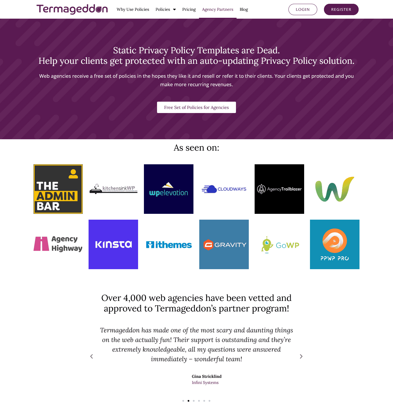
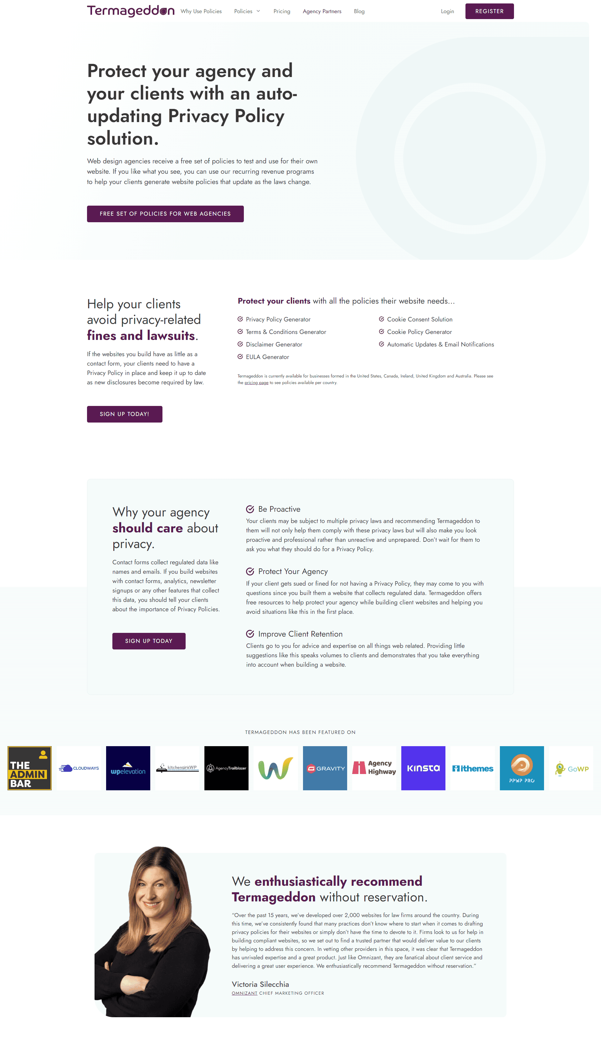
When you break down what a website is actually for, it pretty much comes down to one thing: connecting businesses with customers. As I’ve already mentioned, one of the core users of Termaggedon is digital agencies and website designers; their Agency Partner Programme has already attracted over 5,000 partners.
The old page dedicated to promoting the program was bland and uninspiring, skipping over the many benefits of becoming a partner, while the new page for agencies highlights the many benefits of joining the program:
“It’s been about a month since we launched the website, and we’ve had a 50% increase in agency partner applications already.”
We also updated the language throughout the site’s copywriting to focus on the benefits and solutions available to the reader.
This was done mostly by editing the existing copy to focus on the benefits of their service, not the features.
The result of these efforts is a 50% increase in agency partner applications — which will make a significant impact on the company’s financials.
See what Termageddon co-founder, Hans Skillrud, had to say about the how the new website is affecting their key performance indicators
Performance Improvements
Performance is integral to the success of any website project.
To get complete insight into how their old website worked, and to measure the success of the new website, I used a combination of three tools to measure performance:
- Lighthouse
- PageSpeed Insights
- GTMetrix
This combination of tests gives me a wide range of data to examine and ensure that my websites are performing well on every possible metric.
Let’s take a look at the transformation of the website’s performance according to Lightouse, which is the most comprehensive of the testing tools used.
Lighthouse Testing
Lighthouse tests give you a combination of performance, accessibility, best practices, and SEO scores.
The old site was a mixed bag. Performance was a worrying 31/100, SEO was a not-so-great 89/100, and there was still room for improvement with accessibility at 98/100 and best practices at 92/100.

The poor performance score was due to a variety of reasons, including:
- A pretty poor First Contentful Paint score of 2.5s
- An eye-watering Speed Index score of 7.6s
- A truly horrific Largest Contentful Paint score of 14s
- And an inexcusable Time to Interactive score of 13.8s
Reasons for these poor scores include:
- A slow server response time
- Unused JavaScript
- Unused CSS
- Render-blocking resources
- An inefficient caching policy
- Not using passive listeners to improve scrolling
After rebuilding the new site with best practices implemented, users no longer have to wait to explore everything Termaggedon offers them.
The improvements to the site’s performance are phenomenal. The speed index went from 7.6 seconds to 2.1 seconds. Largest contentful paint came down from 14 seconds to 2.2. And the biggest change was the time to interactive, which is now at 2.1 seconds (down from 13.8 seconds).

SEO Improvements
While the old website wasn’t having any major SEO issues, both tests and manual audits revealed there were some opportunities for improvement.

Some of the SEO improvements included:
- Improving the site structure
- Updated title and meta tags
- Indexing and no-indexing pages appropriately
- ALT tags for images
- Updated XML sitemap
- Implementing SCHEMA markup
- Performance enhancements that improve SEO
The results in testing are obvious, but the best news was hearing that within a month of the website going live they were already moving up the search rankings. This includes moving from the 2nd page of search results to the first for some of their primary (and highly-competitive) keyowords.

Accessibility Improvements
Anyone that owns/runs/builds a website should know just how important accessibility is. Not only does following accessibility standards help you avoid ADA lawsuits, more importantly it enables more people to access and enjoy your website.
The old website scored an already-impressive 98/100 for accessibility, but I knew that we could get that score to 100; there’s always room to make websites more accessible!

Termageddon decided to hire a team of Accessibility experts to manually audit the new website. What they came back with was a very in-depth, 32 page report on all their findings.
We were able to remediate any of the accessibility concerns for the live version of the website, ensuring the new Termageddon website is as accessible as possible for all visitors, which included:
- Text alternatives for audio & video content
- Keyboard accessible navigation throughout the website
- Meaningful sequence of all DOM elements
- AAA color contrast ratios
- Adaptable text sizes
- Hover & focus states
- Proper focus order
- Descriptive headings and labels

What Termageddon Says
See what Termageddon co-founder, Hans Skillrud, had to say about working with OGAL Web Design:
“When we started this new website project I knew Kyle was professional, but I was not anticipating the level of communication and the speed at which he could get things done.
He brings the ability to understand the overarching goal and how we’re going to get there, but then on a micro level communicates with us daily on what he’s up to. That level of communication is rare in this space, speaking from experience as an agency owner, it’s a rarity.
I would say if you are looking for a web designer that you can trust for the long haul, Kyle is your person. I would absolutely recommend him to any person who’s serious about getting proper exposure with a professional online presence.”
Wrapping Things Up
With their updated look, refreshed approach, and impressive website performance, Termageddon have a solid foundation to continue growing their reputation and reach in the world of website policies.
At the heart of every website’s purpose is the basic need for people to be able to use it and interact with it. Optimizing your website’s performance and bringing its accessibility up to current standards is essential to attracting and converting customers to your business.
Your website is your 24/7 online representative – if it’s not welcoming to everyone, you’re going to lose business (there’s no two ways about it). Not only do website users expect a beautifully-designed website that’s built to perform, Google does too.
How does your website measure up?
I’d love to chat with you about your goals online and help you understand your own performance scores and what could be done to improve them. If you’d like to chat, let’s schedule a call.