
Your website’s navigation is arguably one of the most important aspects of your entire website.
Get it right, and users can spend more time on your website navigating from page to page intuitively.
But if done wrong — a user will leave quickly. The idea of “learning” how to use your website will not appeal to anyone.
The options inside the customizer to lay out your header in GeneratePress will suffice for basic layouts; navigation on the right, navigation on the left, centered navigation, etc.
But there are a few common layouts that you just can’t do with the customizer settings alone.


The last two examples are extremely common for product/software companies — and for good reason. These layouts make the navigation section of the website extremely clear, giving distinction to its branding, navigation, and calls to action.
In this tutorial, I’m going to walk you through how to create these different layouts so you can achieve some more modern header designs.
Basic Setup
Inside your GeneratePress (or GeneratePress Premium) Customizer settings, make sure you have the following:
- Layout > Primary Navigation
- Navigation Location: Float Right
Now, we need just a little bit of CSS to lay the foundation of all the configurations we’ll try out.
Inside your Customizer > Additional CSS or your child theme, add the following CSS:
.nav-float-right #site-navigation {
        margin-left: 0;
}

.main-navigation {
	width: 100%;
}

#primary-menu {
	width: 100%;
}
With this in place, we can start to explore the different configurations.
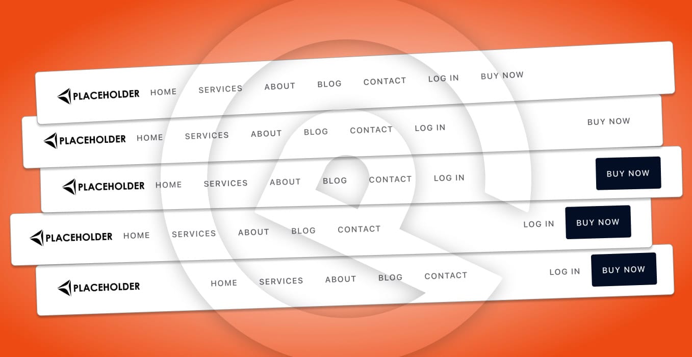
At this point, your navigation should look something like this:
It’s already starting to take shape, but now we need to play with some different configurations to make things a little more interesting!
Left Navigation, Last Item on Right
Yes, naming things is hard — so I’ve just tried to go with the most descriptive titles possible.
In other words, this:
As you can see, the last menu item has now moved to the right side of the container, separate from all its navigation item friends.
To achieve this, you just need to add the following CSS to what you’ve already added:
.main-navigation li:last-child{
	margin-left: auto;
}
It’s already looking nice — but I think we need to draw some more attention to that Buy Now link and turn it into a call-to-action.
Make the Last Menu Item a Button
In order to draw some more attention to the last menu item, let’s try styling it like a button — so that it looks more like this:
Yes! That’s much better!
To do that, just add the following CSS as a starting point (you’ll want to customize all this CSS to match your branding):
        /* Natural State */
.main-navigation .main-nav ul li:last-child a{
	color: #fff;
	background-color: #000e26;
	border-radius: 4px;
}
	/* Hover State */
.main-navigation .main-nav ul li:last-child a:hover{
	color: #fff;
	background-color: red;
	border-radius: 4px;
}
But, looking at it, it seems like the “Log In” menu item should be grouped over there with the buy now button since they are closely related.
Left Navigation with Last 2 Items on the Right
In order to achieve this, we need to go back and edit some of the CSS we already wrote.
Find this line in your CSS:
.main-navigation li:last-child{
	margin-left: auto;
}
And replace it with this:
.main-navigation li:nth-last-child(2){
	margin-left: auto;
}
And voilà — look what we have now!
This is looking great. But, is there anything else we could try?
Center Align Navigation with Button on Right
Sometimes, when you have a text-based logo, the navigation on the left doesn’t look great. The logo and navigation items blend a little too much, and they need some separation.
So what about center aligning the navigation while keeping the logo on the left and the button on the right? Yep, we can do that!
All you need to do is add one more line of CSS
.main-navigation li:first-child{
	margin-left: auto;
}
At this point, your navigation should look more like this:
What about tablet and mobile views?
If you’ve already previewed your site on tablet and mobile, then you’ve already seen there are some issues.
Thankfully, these are easy to fix with our good friend; the media query!
Just before any of the CSS you entered from this tutorial, add the following line:
@media (min-width: 1025px) {And after the last bit of CSS from this tutorial, add this line:
}Now the entire setup we wrote is confined to only affecting the desktop layout (I tend to swap to the hamburger menu for tablet and mobile, which works best in 99% of cases).
Wrapping Up
While some themes give you more options out of the box (and some might be able to achieve the layouts we created in this post), but with all those options comes more settings to keep up with and extra code “baked in” to your site that you might never use.
That’s one thing I love about working exclusively with GeneratePress.
You are given the foundation that works in 90% of cases, and with just a few little tweaks you can accomplish any layout you dream up — all without bogging down your site with extra code from all the bells and whistles.
Just what you need, and not a thing more — that’s the key to performance.
If you need any help with your GeneratePress site (or are looking to move to GeneratePress), then don’t hesitate to reach out.
I offer a “convert to blocks” service that can drastically speed up your site and make it easy to manage using GeneratePress and GenerateBlocks.
