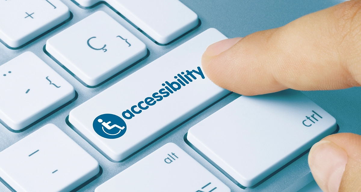

It’s crazy to think that there was a time when businesses didn’t need to offer wheelchair access to their premises. But if your website isn’t built to meet web content accessibility guidelines, you’re like a physical store with stairs and no access ramp. You’re in breach of the law, you’re overlooking your customers with disabilities, and you’re turning away potential business.
The Americans with Disabilities Act requires that every website, not just the websites of large companies, is accessible to all users.
The Americans with Disabilities Act requires that every website, not just the websites of large companies, is accessible to all users. And there are severe penalties for those found to be non-compliant. Plus, making your website accessible to all users is sound business sense, as a frustrating website experience will turn off potential customers.
Creating an ADA compliant website isn’t a once-off task. No website is 100% accessible – it’s an ongoing pursuit to always be more accessible. But the pursuit is worth it – for your company, and your customers. Here are my best tips for making your website more accessible.
Most Important Website Accessibility Aspects
We’ll start by taking a look at the most vital elements — those that are going to affect every page of your website. By tackling these issues first, you can ensure you get the “biggest bang for your buck” so to speak.
Desktop and mobile navigation are functional without a mouse
Many users rely on keyboard navigation only, and it’s one of the most critical elements of website accessibility. People with motor disabilities or tremors may not be able to use a mouse, so your website should be fully navigable using the keyboard only.
All focus elements have clear outlines
Website elements can have “focus” if the user can interact with them in some way, such as clicking a link or changing an option. Only one element can have focus at a time, and users with disabilities use screen readers or other assistive technology to change the focus so that they can move around the website and click where they want. All focus elements should interact with keyboard commands, and all of them should have a clear (minimum 2px) outline so that they are obvious to all users.
Ensure your color contrast meets requirements
Sharp color contrasts help users with visual disabilities view your website design and read your text easier. For standards on color contrast, visit W3.org’s guidelines here.
Use skip links
Including a skip link as the first focusable element on each page allows keyboard users and users of assistive technology to skip parts of the page that are repeated on every page, like the top navigation. That way, users can find the main content quickly.
Only underline link text
Stop underlining text for emphasis. Only linked text should be underlined. Otherwise, it can be confusing and frustrating for users who expect underlined text to include a link.
Use a language declaration for each page
Identifying the primary language of a webpage in your code allows screen readers to read the content accurately. For that reason, it’s also essential to indicate in the code any place where the language may change on the page.
Underline links in text
Don’t rely on color alone to indicate that a phrase or word in the text is linked. Instead, always underline linked text. That’s the standard for all online content, so follow it. Most WordPress themes allow you to enable or disable this site-wide.
Other Important Accessibility Factors
Many of these other items only affect certain portions or elements of your website. All of them are important, but you might need to roll up your sleeves to suss these all out.
Eliminate empty buttons or links
Cleaning up broken or empty buttons and links is a standard of SEO best practices and will improve your search rankings. But it goes deeper than that. Empty and broken buttons and links are confusing and frustrating for users with disabilities, so test your links and buttons regularly to ensure they’re all working.
Ensure forms are accessible
If your forms aren’t accessible, you risk turning off users and losing leads. To make your forms accessible, check that:
- Boxes are labeled, and required ones are clearly marked with “required” rather than just an asterisk
- Any CAPTCHAs used are accessible
- Input errors can be read by screen readers
- Input success can be read by screen readers
Caption your videos
If your videos don’t include accurate captions, users with hearing impairments don’t know what they’re saying. So your expensive video is useless in creating a conversion, and you risk turning off a potential client if you don’t include video captions.
Use meaningful link anchors
A link anchor should describe what happens when clicked. So instead of “Click here” your anchor text could read “Click here to book your tickets”.
Stick to headings in order
When creating headings and subheadings in your content, use h1 for the main heading, h2 for the next important, etc. Don’t skip around in the order. For example, if you title your page with an h1, don’t use h3 for the first subheading. Use h2. You can read more about heading structures here.
Include pause buttons on autoplay content
Any video or audio file that plays automatically when a user visits your site should include an explicit “pause” button. Video and audio can be confusing for anyone when they land on a website, not just users with disabilities. Offering a way to pause the video or audio content will be appreciated by everyone.
Alt text should be accurate
Alt text, also called alt tag or alt description, is the text that accompanies an image. If that image fails to load, the alt text will appear in its place. Ensuring that alt text is accurate not only makes it easier for users to understand the context of the image that should appear, but it also improves your search engine rankings and is good SEO practice.
Notify before opening a link in a new tab
Opening a new tab or window without warning can be disorienting to people with visual or cognitive disabilities. Without ‘seeing’ what’s happening on their browser, they lose the ability to hit the ‘back’ button and return to what they were on before. So, make sure the option to notify users before opening a new tab or window is selected every time you create a link.
Never use all caps
Words in all caps can be difficult for anyone to read, especially people with reading disabilities. Also, screen readers often read the text in all caps letter by letter rather than as a word, so it can be very confusing for people who rely on screen readers.
Don’t use parallax, entrance animations, and background videos
On-screen motion can be disorienting or hard to navigate for some users, and for others, it can induce motion sickness. If you must use animations, parallax, or videos on your website, include a way for users to opt-out of viewing those features on your site.
Use numerical pagination instead of infinite scroll
Websites that load more and more content as users scroll down are described as “infinite scroll”, and designers love them because they eliminate the need for pages. But infinite scroll is tricky to use without a mouse or for users who rely on a screen reader. So instead, use pagination to make your site easy for everyone to navigate.
Provide accurate headers for tables
For people who use screen readers and other accessibility tools, it’s imperative to organize your tables correctly. Assistive devices use markers in the HTML to define the header cells from the data cells and communicate their relationship to the user. W3 offers some guidelines on various types of tables here.
Jump and anchor links shift the keyboard focus
For users who rely on their keyboard instead of a mouse to scroll and click links, it’s important that the focus can shift along with any jump or anchor links they click. You can see an example here.
Make pop ups accessible
First, evaluate whether you need a popup as it can be disorienting for certain users. If you decide you need a popup, create one that is accessible by:
- Making the focus shift to the popup when it opens and allowing screen readers to announce that a popup has opened.
- Locking the tab key focus to the popup so that users cannot leave the popup without closing it.
- Ensuring the “close” button is clearly labeled and works with a keyboard or by allowing the “Escape” key to close the popup.
- Designing the focus to return to the user’s previous page position after the popup closes, so users don’t lose what they were doing when the popup opened.
Get website accessibility help from a professional web designer
Look, I know meeting website accessibility requirements can feel overwhelming. But it’s vital from legal, ethical, and business perspectives, so you really can’t ignore it.
If you want help making your website accessible, complete my brief project inquiry form, and we can schedule a meeting to discuss your project in detail. It’s just an exploratory discussion – completely free with no strings attached. But it’s a conversation that could save your company from a non-compliance lawsuit, and it could help you reach more clients and convert more leads.


