
Anyone that knows me knows I’m a huge fan of content marketing. I mean — what you’re reading right now is my content marketing (just in case you needed proof that it works).
There’s a lot that goes into content marketing, but a key ingredient through the years (and the many algorithm updates) has always been regular blogging. If you’re not already sold on the benefits of blogging, not only does it improve your rank on search engines, it helps boost your authority with your readers too.
Keeping the all-seeing Google happy is essential, but keeping your site enjoyable and accessible for your human visitors is possibly even more important. And while there are a lot of articles out there covering how to write relevant content, an often-overlooked aspect of creating content is making your blog easy to read and enjoyable to look at.
With Google’s Helpful Content update in 2022, the more engaged your visitors are (the longer they spend on your site reading blogs, the more they interact with your website) the better you’ll rank.
This makes getting your blog layouts just right a key piece of your website’s design and overall success online.
There are all kinds of ways to lay out a blog, but I’ve found a few subtle tweaks to important elements can make a blog more visually appealing and dramatically improve the readability — giving your target audience a more enjoyable experience.
And who wouldn’t want that?
If you follow these principles in your blog post template, you’ll improve the reader retention and conversion rates of your content instantly — so let’s get started!
Blog Layout Best Practices
Content Width
One of the biggest mistakes you can make with your blog post template is making the content area too wide.
If the reader’s eyes are having to physically move back and forth as they move from one line to the next in the body text, it makes the blog extremely difficult to read.
By making your content area’s width narrower, you make it easier on the eyes and easier to follow along.
Popular blogging sites like Medium and Buzzfeed adhere to this with very narrow widths for the content of their posts (highlighted with a red box below)


These blogs get millions of visitors per year and the readability of their posts is paramount — so it’s not a bad idea to take their lead on this one.
How wide should my content be?
What you want to avoid here is answering this question with some kind of pixel value. The size of your text could dramatically affect how wide your container should be.
So, to account for this, I like to use a lesser-known value called “character width” (or ‘ch’ unit). A ch is the width of the number 0 in your chosen font and font size.
The rule of thumb is you want to keep your long-form content between 60-70ch wide.
This means that no more than 60-70 zeros fit on one line.
For larger text (like 20px, for example) your content can be a lot wider than if you’re using a smaller font size (like 16px). But by using the ch unit, you’ll ensure that no matter the font size, your text is never too wide!
Headline Margin
Proximity is one of the most important design fundamentals. We intuitively know that things that are close to each other have more relation than things that are far apart.
The headlines in your blog post can fall victim to proximity issues if you’re not careful.
In a lot of WordPress themes, the margin above a headline and below it is identical (or nearly identical). Because of this, it’s hard to tell what block of text your headline belongs to (and it’s always the block of text below it).
Keep in mind that people don’t read blog posts (or anything online, really) like they would a book. They often scan articles to find exactly what they need.
By providing this visual separation and improved proximity, you make your content more easily scannable.
You can fix this issue by giving your headings inside of the body of your post a little extra top margin. I’ll typically start with 1.5em, but sometimes go all the way up to 2em.
Here’s an example of a floating headline that suffers from the proximity issue I’ve described:

But if we add some top margin to the headline, you can clearly tell that you’re starting a new section of the post:

By following this principle, you create a nice visual rhythm down the blog page that makes your content more scannable.
Image Styling
We know that using relevant images inside your blog posts make them more engaging, but just chucking any old image into your blog layout is a little uninspired.
It’s important we don’t get too crazy with it, but giving some kind of default styles to your blog post images can really make your blog posts stand out, make them more memorable, and give your blog a little character.
One way to do this is by adding a border radius to your blog images, which rounds the corners and makes them feel a little more finished.
It’s a subtle change, but if you look at a hard corner image next to one with a slight radius, you’ll see that the tiny change can add that extra level of polish.

You might have noticed that I take this a step further on my images, adding a slight shadow and border to the photo (on top of rounded corners). While it might not be everyone’s taste it does help make the images on my blog look more consistent, even if the style of photo is drastically different.
This little visual hook helps people easily recognize patterns on your website and makes it feel more custom.
Break the Monotony
Let’s face it — our attention spans have gone down dramatically since we started spending our lives online.
We’re constantly being bombarded by notifications and alerts that can make it hard to focus on something for an extended period of time — especially long-form written content.
One way to keep the reader engaged is by breaking up the monotony that comes with long pieces of text.
This can be done by creating repeated callout sections, blockquotes, a progress bar, or other variations on your text that you can strategically place throughout your posts.
You’ll notice this post (and almost every article you find on my website) avoids the dreaded “wall of text” by breaking things up with callouts and images.
These break the monotony of reading and make things more visually interesting.
Typically I build in a few different repeatable patterns in a theme to break up posts (like blockquotes, summary boxes, high quality images, or a call to action). This way, when I’m getting a post ready to publish I can scan it and look for opportunities to break up large portions of text. When it comes to blog design, white space is your friend.
My rule of thumb for good design is that the reader shouldn’t scroll twice without something that breaks up the text (which would include headlines and images).
Stylize Links
I would suggest that you don’t over-style any of the links on the page of your website, however, long-form blog content can handle a little more customization than your typical website page.
Of course, you’re going to want to stick with some of the accessibility best practices (like having more than just color indicate a link), there are lots of fun ways you can style your links.
Here are a few styles I keep inside of my starter theme that I can use on projects:


Using internal links on your blog is a great way to reduce your bounce rate and increase the amount of time people spend on your website. This makes giving your links a little love a worthwhile investment.
Plus, giving your links a little character is a great way to break up the monotony of a blog post — two birds, one stone!
Wrapping Up
Customizing your blog post layout is a task worth spending a little time on. For a lot of businesses, especially those in the tech industry, a blog post could be your first impression or what convinces a customer to sign up for your product or service.
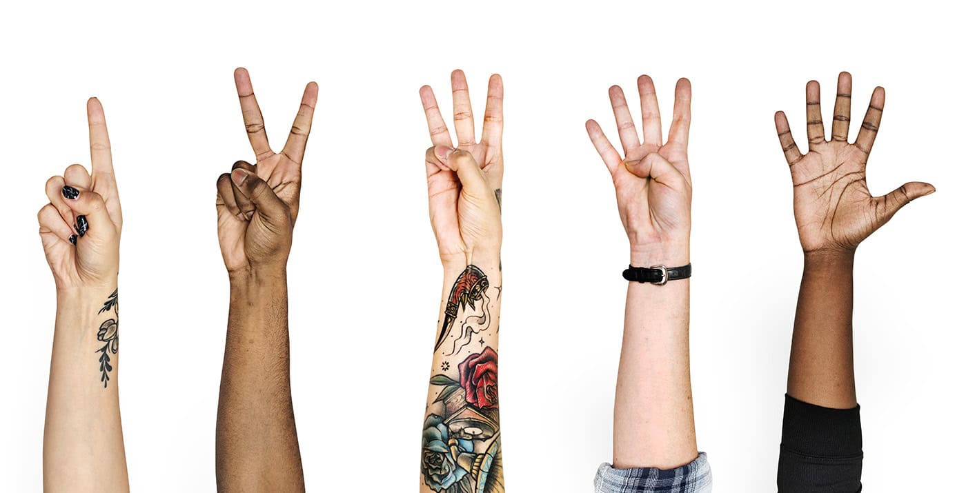
The 5 tips I included in this blog post can dramatically change the look and feel of your posts making them easier to read and more enjoyable — and they are things that are often overlooked.
With blog design best practice implemented, you should see a dramatic increase in your content’s performance – with visitors staying on your site longer and Google boosting it up the search results to drive traffic to your website (maybe even achieving a coveted featured snippet).
The end result? Your content marketing performs better, your site converts better, and the investment you put into your blogging is worth so much more.
Blog post layout inspiration
If you need a little inspiration for your next blog article, check out these projects where I’ve implemented these blog design elements: